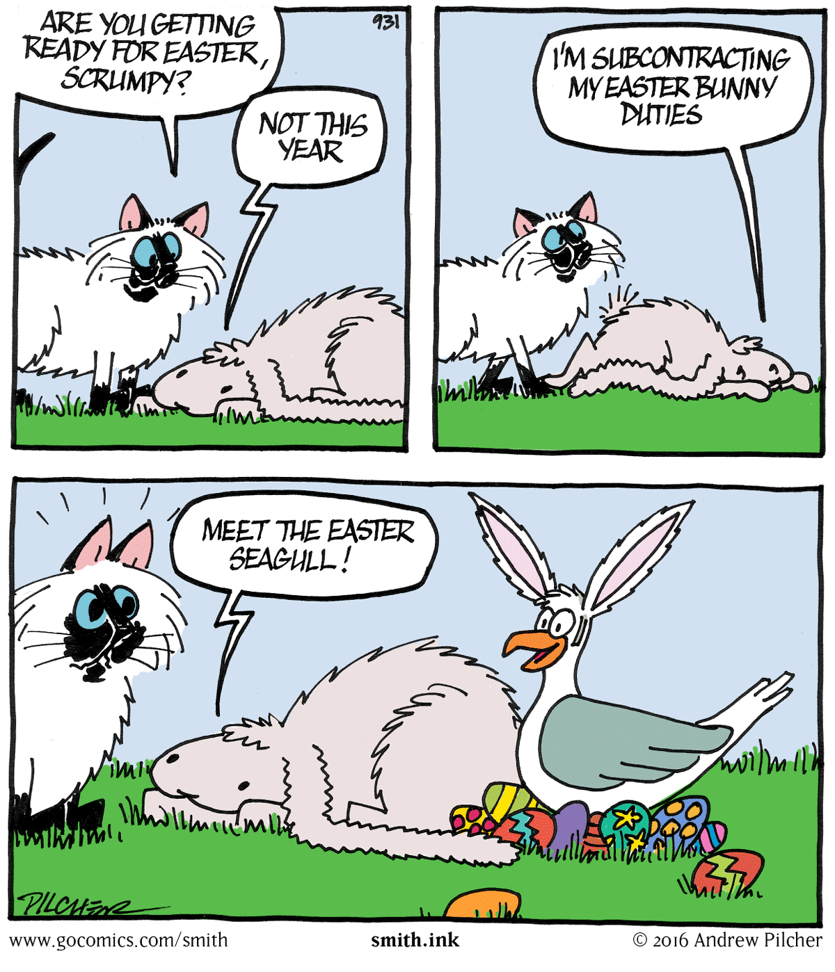
Scrumpy’s eyes have slowly been slipping down his face over the years, and while it’s been useful in making him look more downbeat it’s also been making him look less and less like a rabbit. I’ve moved his eyes back up again, and I’m much happier with him now. His eyes will continue to shift up and down his nose according to mood, but this should be their default position.
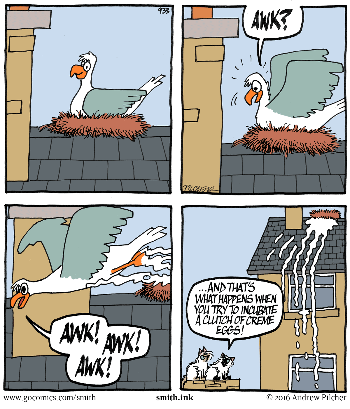
Creme egg
This is my first diabetic Easter. I miss Creme Eggs. However, it looks like I don’t really have that much to miss any more…
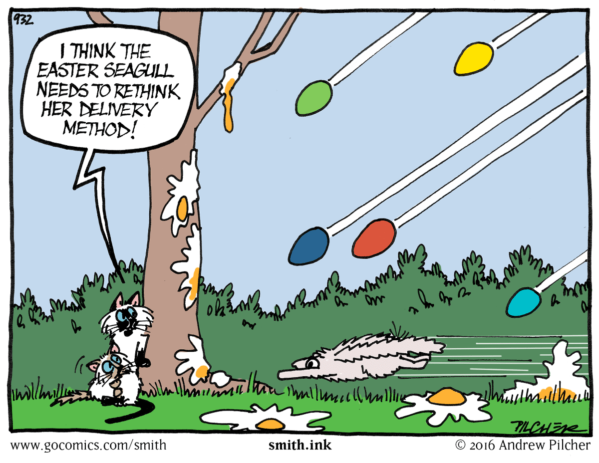
Delivery
That’s the problem with subcontracting your work out – the people involved just don’t have the same involvement in making sure they do a good job. Ask anyone who has had to deal with a company that has subcontracted out its customer care to a call centre in Bangalore. Talktalk Broadband, I haven’t forgotten you, and I note that five years after I gave you up as a lost cause you’re still bottom of Which’s customer service tables.
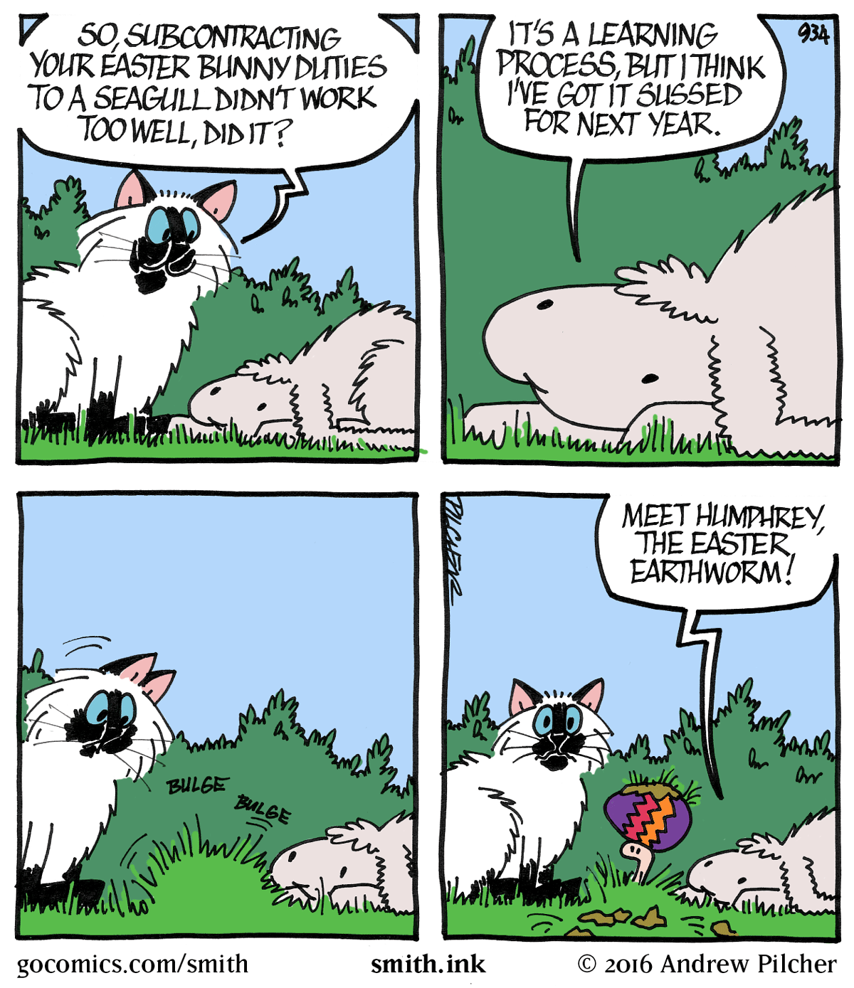
Subcontracting
Hurrah, a strip with an actual cat in it at last! And a rabbit and a seagull.
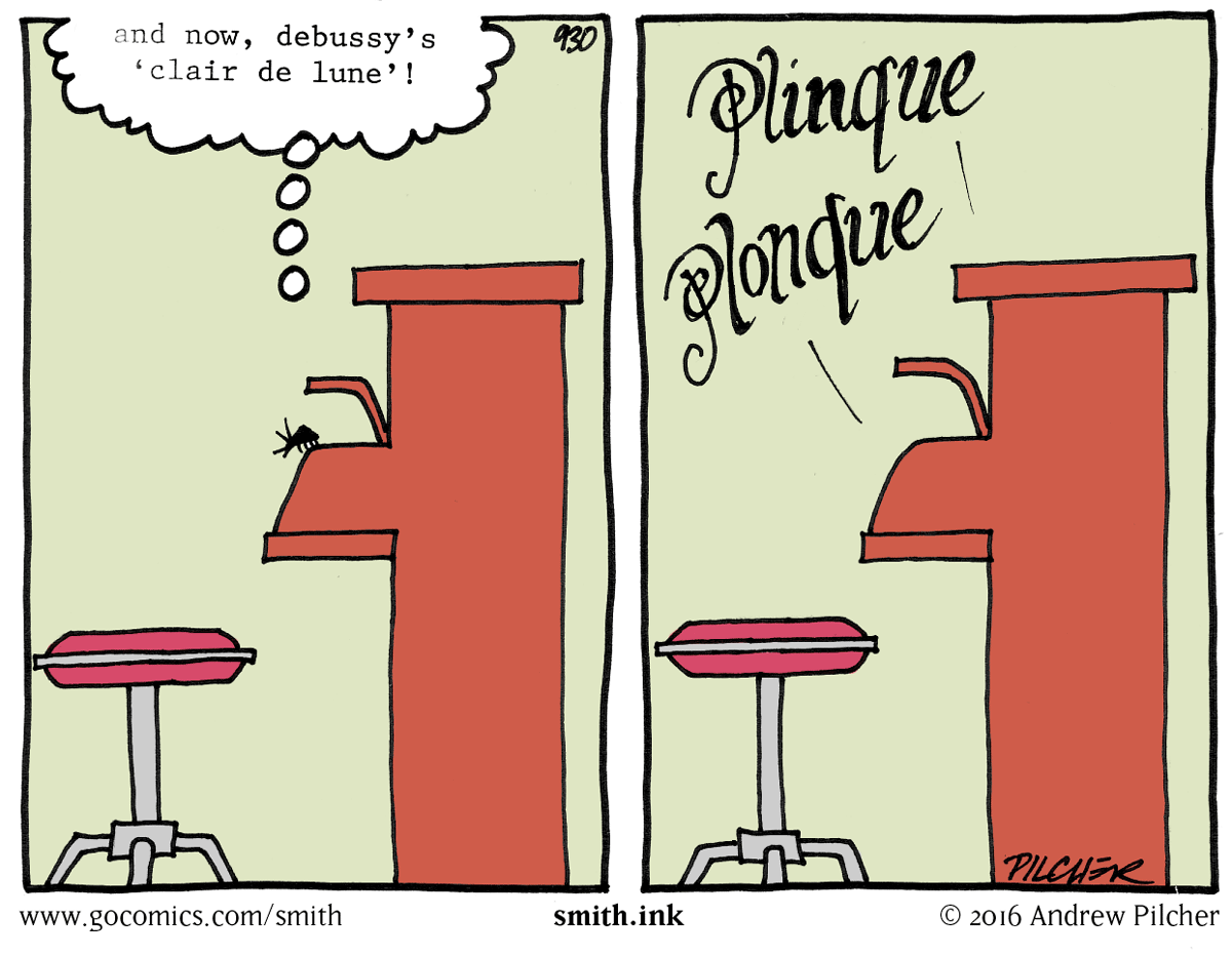
Clair de Lune
I love Debussy, and Linda’s very much a fan as well. She chose Clair de Lune for her walk down the aisle at our wedding.
Can I take this opportunity to recommend a favourite album of mine – the Art of Noise’s ‘The Seduction of Claude Debussy’. Just click on the image of Claude below and wallow for the next hour…
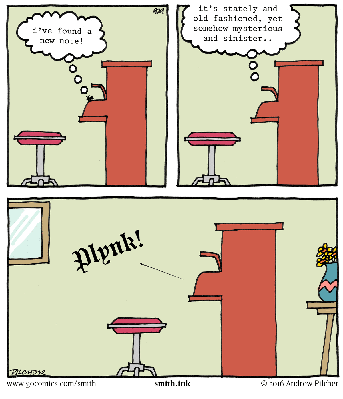
Plynk
No problems, Crookedwolf. Though I wonder if conversation had all the other readers of the strip trying to work out of there was a missing vowel left for me to use in Friday’s strip.
(Strictly speaking, ‘w’ is a vowel in Welsh, so it’s possible to have ‘Plwnk’, which looks like the name of a small railway halt in deepest Anglesey, where the trains stop once a year. It would be pronounced ‘Ploonk’. Sadly, there is no ‘k’ in Welsh, so it wouldn’t work anyway, it would have to be spelled ‘Plwnc’.)
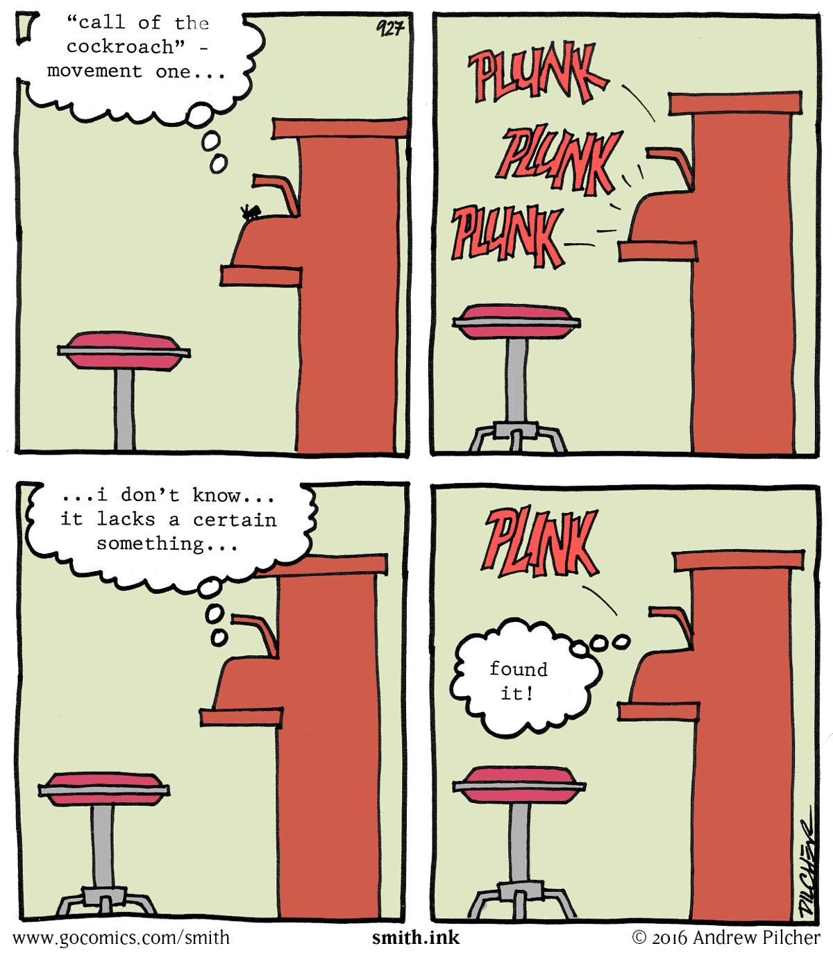
Font nerds, The word ‘Plynk’ was typeset in a font called ‘Sabbath Black‘, a blackletter font by the Emigré foundry. The ‘P’ originally had a gap between the stem and the bowl, like a stencil font, so I joined them together to make the word clearer to read.
Telegraphing the punchline
As I intimated a few days ago, I was stretching this joke beyond its natural limits, so when I published this one, it was inevitable that this was going to happen in the comments underneath it…
Call of the Cockroach
Font nerdery
It’s well known that I’m a font nerd. before the DTP revolution started and everyone discovered that there were such things as different kind of typefaces let alone the difference between the eleven different flavours of Garamond and Times New Roman, my favourite book was the 1975 Letraset catalogue.
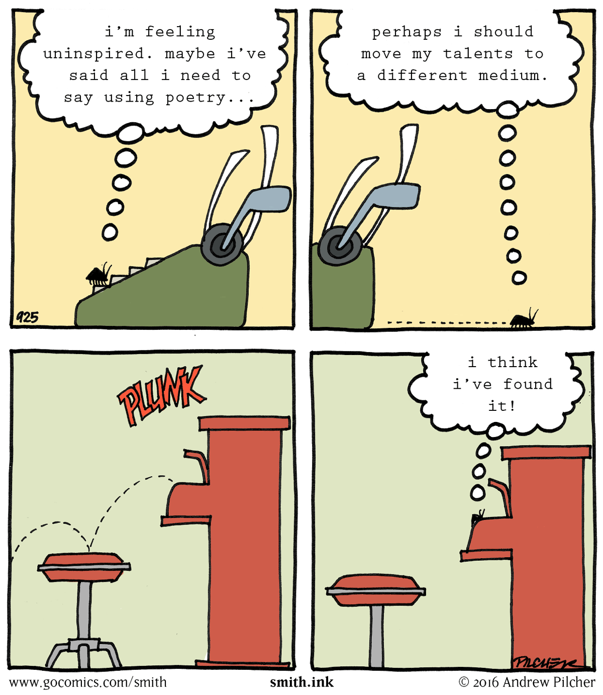
The typewriter font that Arcy is thinking in in this strip is different to the one in the previous two strips. That’s because this time round I had the chance to typeset this at work in a typewriter font I was happy with (Prestige 12 pitch), print it out and paste it down onto the artwork before scanning, whereas the previous strips were done with the font I had available at home, Prestige Elite Standard, which is essentially the same font but doesn’t look quite so analogue, and also typed directly into the Photoshop document, making it look too clean.
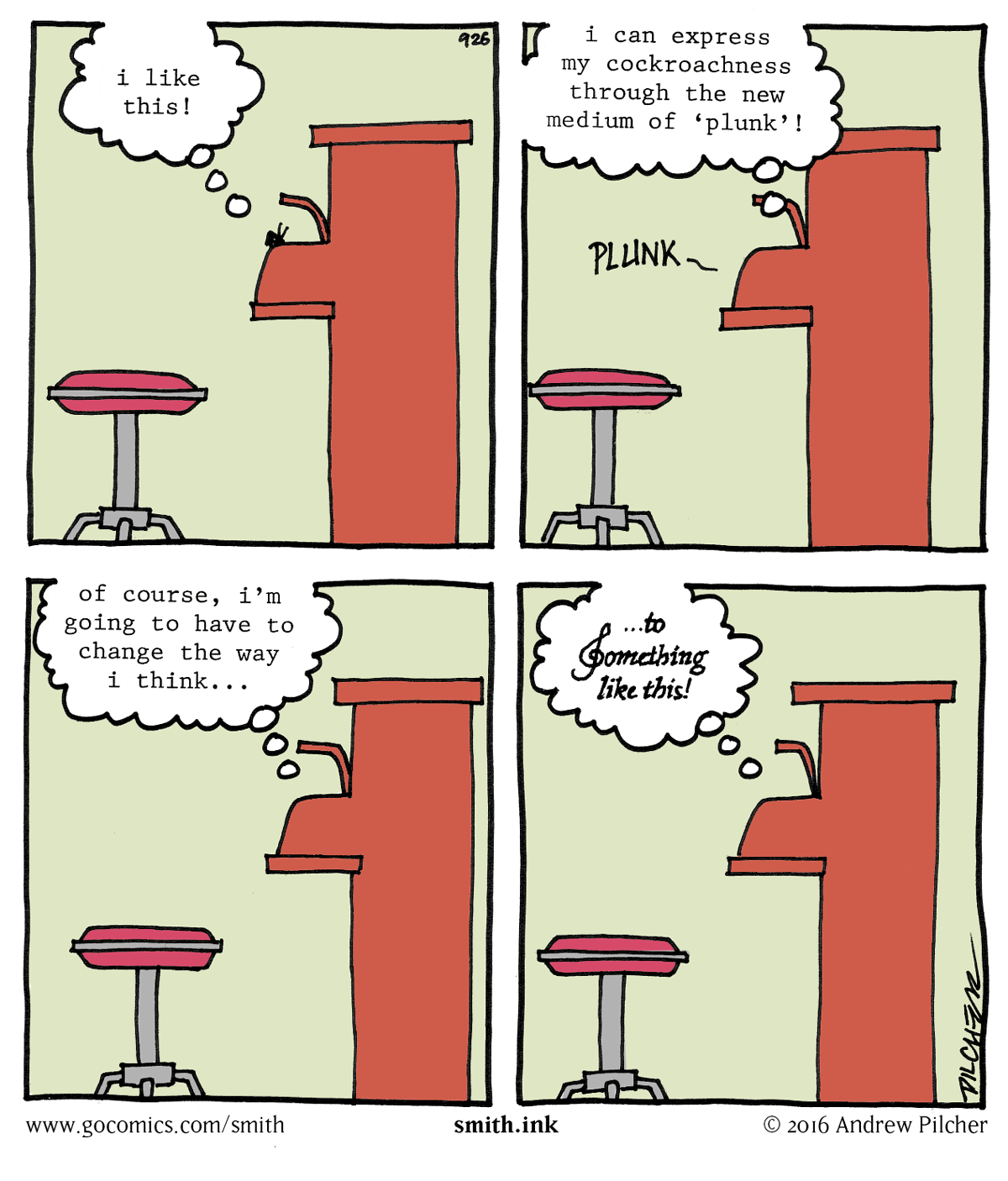
I’ve also always been fascinated by the font that is used in old musical scores from the days before computer typesetting. For some reason all the notes composers made on their score had to be in a particular dense and well-worn italic face, the name of which I don’t know. I simulated my own version of it by typesetting the final balloon in Janson Italic, and then drawing over the top of it with a thin marker pen.
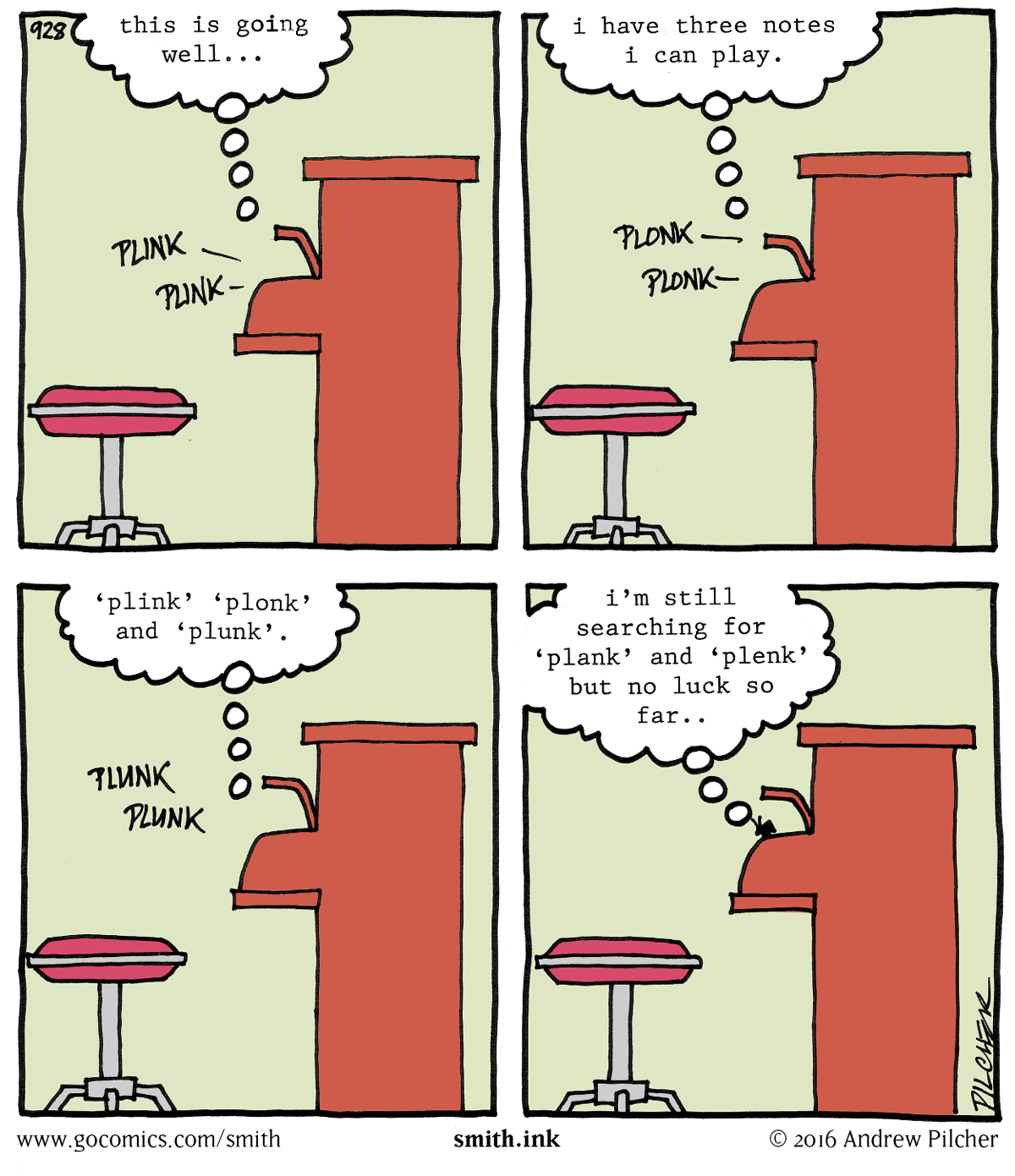
Plunk
…and now watch me stretch this joke to beyond its elastic limit…